Enterprise
Software Solutions
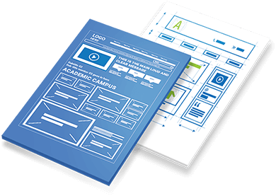
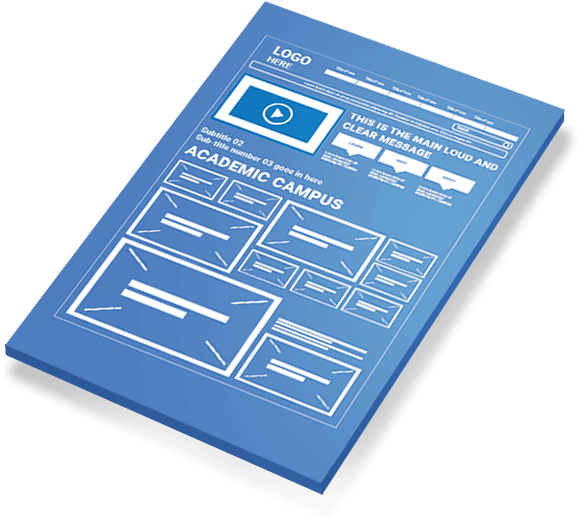
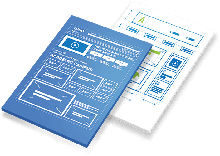
Every website starts with a wireframe.Our UX experts provide detailed blueprints for high-performance
websites. Improve usability with an intuitive layout.
The Key Elements
We design your website from the ground-up using wireframes that reflect user personas and create a friendly user experience for your customers. With intuitive navigation and relevant content, your website will provide a smooth and seamless buyer journey for your target audience.
-
Defining Your Business User Persona
A great website user experience starts with knowing who your visitors are on a more personal level. Instead of only imagining customers as potential conversions, creating a fictitious user who is representative of your target audience with their own name, background, skills, age, education level, and what platform they use to get to your website can provide huge dividends for a business. The purpose of user persona research is figuring out what your visitors’ objectives are when coming to your website.
Listing out a step-by-step process on how a user persona would navigate your website and find the information they’re looking for will provide insights into designing a user friendly website. A user persona that reflects your target audience will give you an understanding of everything you need to know about your visitors, from how to map your wireframes to where to place content for the people it is meant to serve.
-
Designing a Wireframe for Your Business
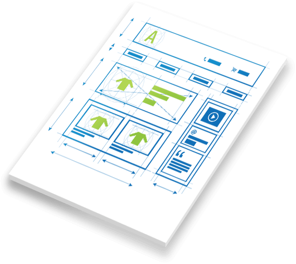
Without putting in the time and effort to construct a wireframe, designing a professional website for your business can be a difficult process. Similar to the layout of a brick-and-mortar retailer as you walk through the front entrance, a proper wireframe that diagrams page flow is crucial to how your website displays the products or services that it offers. You need to prioritize your products or services for easy accessibility while other less important pages can be deeper in the site’s navigation. A carefully thought out wireframe is not only for the pages on a website, but also for determining the placement of individual elements on a page.
-
Streamlining the Navigation Experience for Your Visitors
A natural, intuitive navigation on your website is comparable to a simple, but informative sales pitch that explains who you are, what you have to offer, and how to purchase the products or services you are selling. With an organized website that has consistent navigation, visitors will become comfortable and familiar with exploring your online business, which is the first step towards gaining their trust, bringing them back to the site, and getting them to convert.
No matter how many products or services you have to offer, remembering that “less is more” in your navigation structure is paramount to keeping users engaged with your business. If your website is overwhelming, or offers too many choices to your visitors, they will exit your website and find a competitors’ site that is easier to browse. Likewise, your navigation shouldn’t be so cluttered that a potential customer can’t find the conversion pages and exits your site before completing the purchase process.
-
Structuring Your Content Appropriately
Structuring Your Content Appropriately
Having great content that engages users is only the first step in getting them to achieve actionable results. The placement of content on your pages and website will determine whether visitors actually see it, and if they are likely to interact with it. Putting your most important content above the fold and on the left side of your page is an innate viewer usability factor that immediately grabs the attention of your visitors, ensuring they don’t lose interest in your website because they couldn’t find your content.

