Website Development
Our expert team of Website Developers & Digital Strategists
use cutting edge technology & best practices to create
custom sites that increase user engagement.



Web Development Services
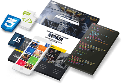
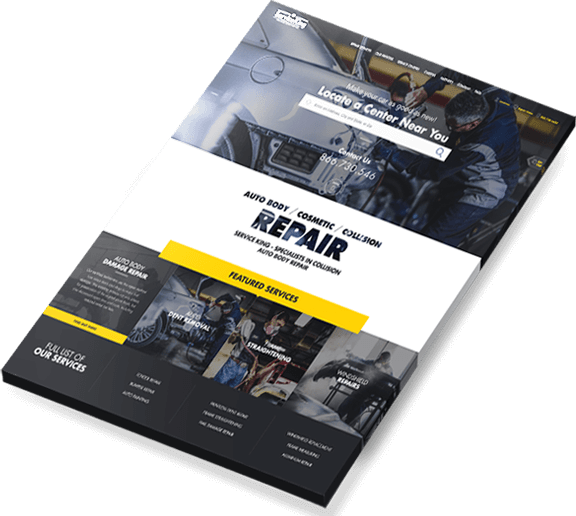
From enterprise level lead generation and ecommerce sites to custom content management systems, our custom web development team deliver sites that perform.
Web Development Process
At Blue Fountain Media, web development is a holistic process. Our websites don’t only look great, they also perform. From the start, we consider your content strategy, information architecture, user-pathways and how to market your site to your audience.
-
Discovery & Strategy Phase
Every professional website design project starts with a discovery and strategy phase where the web design team – consisting of web strategists, account managers, web designers, and technical managers – interview the client stakeholders on their value differentiation, competitive landscape, and goals for the project. The outcome of this phase is a documented timeline, detailed project plan, and a web strategy.

-
Creative Design Mockups led by Website Designer
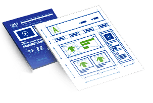
In this phase, website designers roll up their sleeves and start applying color and designs to the wireframes submitted to them by the UX & IA team. The web designers also provide clients with a design storyboard outlining the usage of fonts and colors throughout the site.


-
Responsive Web Design & &
Back-end DevelopmentAll websites are made to be responsive so they will work across various screens, from mobile to tablet to desktop. All frontend coding is done in HTML5, according to best practices, and a CMS (content management system) is customized to give clients the ability to update their responsive sites in real-time.


-
Quality Assurance & Testing
Creating a high quality responsive website requires thorough quality assurance testing on multiple devices to ensure that pages load quickly and properly on mobile, tablet, and desktop. In addition, security measures are put into place and the site is tested for proper SEO performance.

-
Website Launch, Analysis & Optimization
After exhaustive testing in the QA phase, a system administrator takes the new site live and another test is performed to ensure the new customized website is performing as it was designed. During this early launch period, a team also monitors user behaviors on the website and analyzes how to improve performance in order to improve conversion rates, time on site, and repeat visits.
')}}n>
ESSENTIALS FEATURES
OF A WEBSITE DEVELOPMENT
-
Suggested Pages
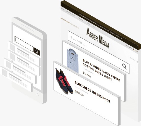
Give users the flexibility to search for the products that they’re interested in. If the search bar suggests results, that will help you sell more by sending traffic to those specific products or categories. Don’t forget to highlight certain promotions as well on seasonal holidays, which can push traffic to specific parts of your website.
-
Related Products
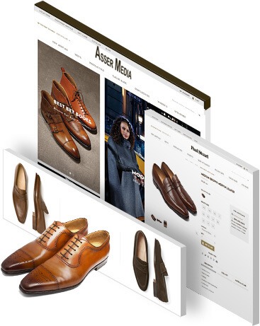
Showing users related products that compliment or are similar to the product page they’re viewing is a great way to increase your bottom line. Using this type of feature can influence users to spend more time and money on your website by showing them products that are like the ones they’ve expressed interested in as opposed to just a random of assortment of products from your website. Furthermore, implementing social media share features on your product pages so you can leverage customers to show your products to friends and colleagues is a great way to get products that are relevant to an audience’s interests on their radar for the first time. Although users can always do this manually, having social share buttons dramatically increases the chances that someone will share a product with their social networks.
-
Product Filtering
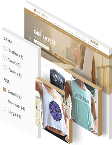
Allowing your users to customize their ecommerce experience on your website by giving them the ability to filter through your category pages based on prices, popularity, and more is an essential tool for any website to have. Customers don’t enjoy clicking through endless pages of products, so having a “View All” option is also a good idea to make things easier. To help customers that are interested in a product on a category page, use a quick preview feature to help your customers decide if they want the product without having to click through to the actual product page.
-
Product Details
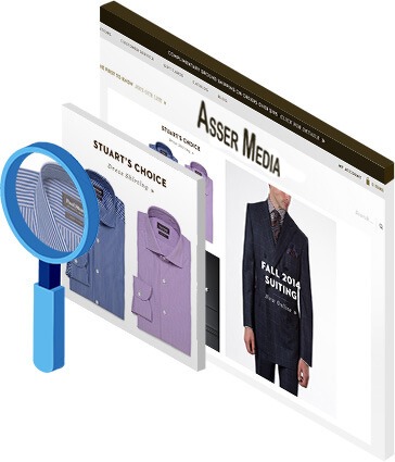
It is very important to provide all of your product information, including extensive details about each of your products in a clean, concise, manner. If a customer cannot find all the product information they are looking for, they may feel too uncertain to complete their purchase. When products, sizes, or colors do happen to go out of stock, allow customers to sign up to be notified of when the product they were looking for becomes available. This way they are less likely to go to a competitor, and it shows that you care about serving their needs.
-
Dynamic Shopping Cart
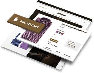
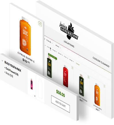
When a visitor adds an item to their shopping cart, make sure to display the cart on the page in a small window that dynamically populates with the product(s) the customer is adding. This way the user experience is smooth and the customer is assured that their goods have been added to the cart. Sometimes, visitors may add a number of items to their shopping cart without having the intention of actually completing their purchase. Rather than forcing your customers to make the choice between deleting a product from your cart or buying it, allow them to save it for later instead.
-
Shipping Options
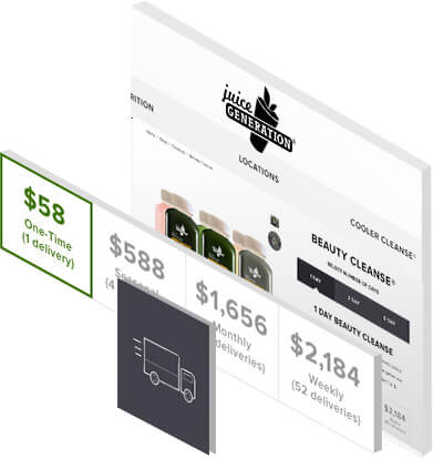
It’s essential for any successful ecommerce site to avoid using a single or flat rate for shipping. Different customers will want different shipping mods – some want their products to arrive immediately and others are fine with paying less for slower shipping. Since the checkout process is a significant investment of time and effort, allow customers to calculate the shipping costs directly from their shopping carts before they start going through the checkout process.
-
Payment Confirmation
Clicking the final “submit payment” button for many customers can be a very stressful moment. Calm their nerves by not only displaying a payment confirmation page, but also by sending them an email confirming receipt of their payment. Provide your customers with tracking information once their order has shipped as well, so that they can feel at ease through the final step of the transaction.

How to Build a
Successful Development Website
-
Set clear goals on every page
Every page of your website should have a defined purpose.
For example, your homepage should entice users to click through to your categories, or better yet, straight through to a product page. From there, your product page should answer any lingering doubts users might have and convince them to make a purchase. Your shopping cart page should simplify the checkout process and have a feature like a follow-up email that reassures shoppers that the transaction was successful. Keep this in mind when planning out the various types of pages that you’ll have on your Development Website.
-
List contact information
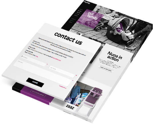
Find ways to make it very simple and enticing for customers to contact you so that it’s easy for them to get in touch with you directly. If you don’t display your contact information visibly for your customers and they have to scour your site for contact information, it could lose you a sale. Outside of listing your location and phone number, you can also provide FAQs, product reviews, or comments for users to read, as well as user-generated content like customer testimonials that highlight satisfied customers that use your products.
-
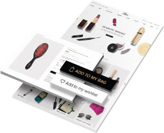
Build brand loyalty
Look for opportunities to bring users back to your website whenever possible. Most people shop online by visiting a number of different websites when searching for a particular product. Ideally, the more times a user visits your website, the more likely they are to make a purchase. A great way to bring users back to your website is with timely emails that go out announcing the arrival of new products or seasonal sales. If a popular item is out of stock, you can also ask for users’ emails and notify them when you have that item back in stock. By doing this, you’re not only servicing their needs, but showing them that you care about their experience beyond selling them a product. Furthermore, you also have their contact information for future email campaigns.
-
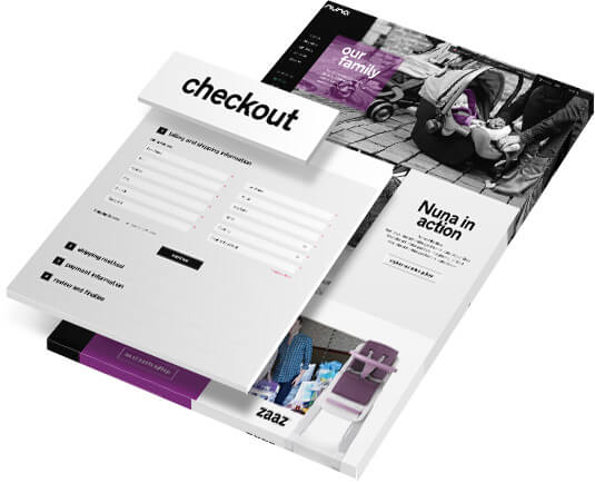
A hassle-free checkout process
Create a checkout process that makes it effortless for your visitors to purchase your products. It has been proven that the more cluttered and complicated an online checkout page becomes, the more likely a customer who was willing to make purchase will just exit your site instead. As well as maintaining a simplified checkout process, work to make your customers clearly aware of extra costs such as flat, expensive shipping rates that could hamper a potential sale. Finally, display trust symbols like VeriSign or McAfee badges proudly on your website in order to indicate that your checkout process has been verified and is secure in order to help ease any fears that potential customers could have when shopping online.
-
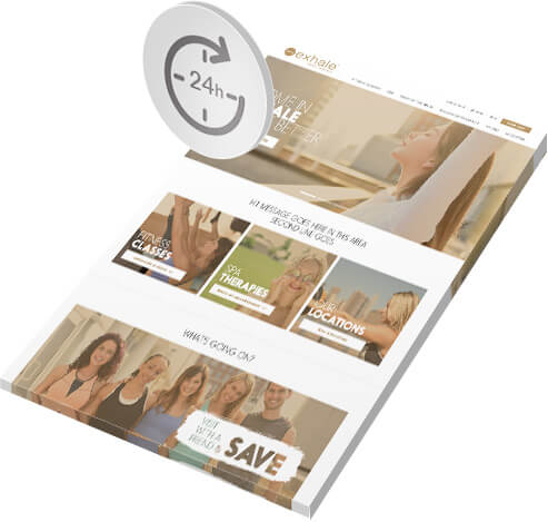
Be up 100% of the time
A website is only a helpful ecommerce tool if it is functioning correctly. Make sure that your hosting plan is reliable and that it has the ability to handle any future needs your website might have. Your hosting plan should grow as your business and orders grow, and if your plan is lagging behind and delaying your shipping or curtailing potential sales, you need to upgrade immediately. Being skimpy on a hosting plan that is not suitable to handle the amount of orders coming in will negatively affect your reputation and lead to decreased sales figures.
Designing an Effective
Development Website
-
User-Friendly Elements
Keep the design of the website as clutter-free as possible. Give users a clear idea of where they are within your website structure with features like breadcrumb navigation and dropdown menus. Also make sure to add elements such as a consistently visible shopping cart through a user’s time on your website so that users know exactly what they have in their cart and how much it costs.
Keep your site from being overwhelming to visitors by avoiding too much information within a small area. On a product page for example, the image of the product, its title, description, availability, price, and similar products are the main elements you need – and adding more will only distract users.

-
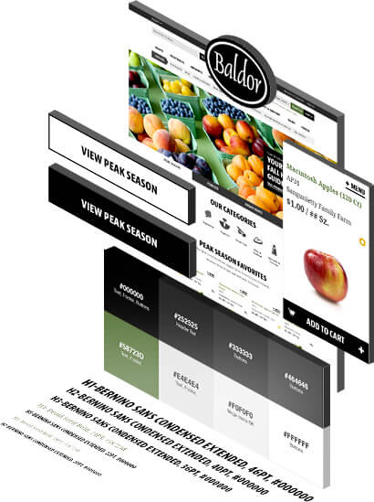
Build Brand Recognition
Whether it’s your colors, your layouts, or style guidelines, keep consistent branding across your website so as to avoid confusing your visitors about who you are as a brand. For example, if you have a variety of different colors used for the same call-to-action button, it may cause a drop-off in sales simply due to the uncertainty that customers experience with the inconsistency of your design. If you’re not sure where to start, looking at major Development Websites and borrowing techniques that seems consistent across many of them is a safe place to start. This is because major websites test their designs over and over again to find out what generates the best results. Some of their techniques can be borrowed for your website, but obviously should be paired with unique design elements like the iconography and imagery standards of your business.
-
Strong Calls-to-Action
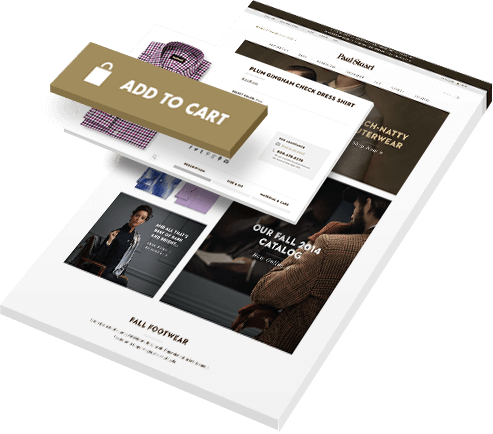
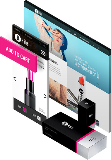
Strong Calls-to-Action Each page where a specific key action is required from a user should have a strong call-to-action, which indicates to the user to take the next step toward accomplishing a goal on the page. A good call-to-action may be “Add to Cart”, “Checkout”, or most importantly, “Submit Payment”. It’s important that you do not have more than one primary call-to-action per page. Secondary calls-to-action are good to have as another choice when a user is not quite ready to commit to the primary goal completion, but should be positioned in such a way that it is used but doesn’t detract from the main goal of a page. For example, they may be willing to download your software demo, but not ready to purchase your software. Rather than lose visitors, keep them on your website for a few more minutes by offering them secondary options.
Back-end of a Strong
Development Website
The ability to control your meta data is crucial when trying to get your website to rank well for various relevant keywords in search engines. You should be able to customize the title tag of every page on your website as well as easily create rules for types of pages to help handle title tag creation. A sitemap.xml file tells search engines about all the pages on your website, and ensures that those pages get crawled. However, you don’t want to have to write the page title of each and every product on your website. Instead, creating rules for each product will help you optimize a large number of product pages all at once.
If you have a website that is constantly adding new content, you need to have a way to easily add essential code to new pages. This includes things like the Google Analytics tracking code, Website Optimization software code, or any other third-party javascript code that needs to be included on every page of your site. Having this set up ahead of time will compress testing timelines by skipping the need for a web developer each time work is required. This is particularly helpful when existing code simply needs slight modifications in order to continue providing your business with the functionality it needs.
As the owner of your website, you should have a place where you can review all pertinent information regarding how your site is performing. Your website’s dashboard should be customizable and offer summary information about stock items, information requests, sales figures, and ecommerce performance metrics. By having a comprehensive understanding of the status of each sale that comes from your website, shipping orders, and customer information, you can consistently update product colors, sizes, and descriptions to decide which categories or subcategories to feature on the home page or navigational menus based on your customers’ purchasing patterns.
Lack of trustbuilding elements
If website visitors don't trust you as a reputable company then they will most likely not do business with you. Our interface designers and online marketers have conducted multiple tests to find out what works and what doesn’t when it comes to trust building elements. Take a look at this test that we conducted on our own web form: WEB FORM A/B TESTING: HOW I INCREASED FORM FILLS BY 37%
Messagemismatching
This is when the messaging on your website doesn’t match up with the expectations set by your advertising or does not fulfill the needs of your potential customers. This can result in high bounce rates and a low ROI for a website that is otherwise well designed. That is why we analyze your customer base and to better understand their needs to craft the appropriate messaging online sales strategy for your website.
Web development shortcomings
Too many times, front-end coders and back-end developers take shortcuts. Things like slow page load time, incompatibility with specific web browsers or mobile devices, and broken pages lead to potential customers leaving your website. That is why we have strict development standards that make our websites compatible, fast, and ready for search engine optimization.

